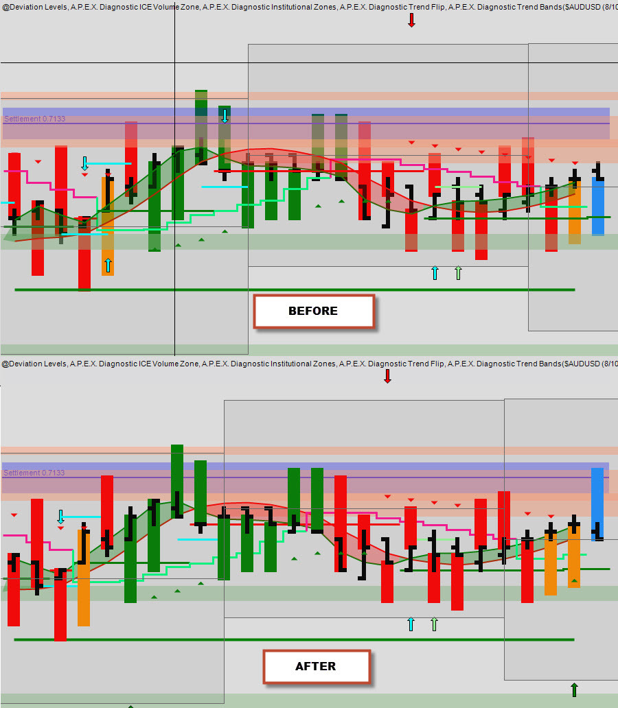
Do you find your chart a bit confusing and hard to see what’s going on?
If you’re like me and tend to load up your chart with all these great indicators Apex provide for us…
You’re likely to run into an issue where your IZones, ICE or trend bands are covering your candles and it’s getting harder to see what’s happening.
So I was asking around and researching for ways to rearrange my chart and make it clear what it’s showing me.
It took awhile but I finally found the answer…
- Click on the object you want to move
- Hold down shift and scroll your mouse wheel
- It’ll say Level # of ##
- Level 1 is the front and highest# is the back
Look at the image [One of my simple charts :)]
the difference is subtle but effective!
It was an AHA moment for me
Hopefully this is of some help to you
Thanks!